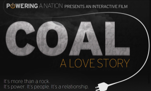
“Coal: A Love Story” Usability Test

I began my usability test by exploring the “Coal A Love Story” webpage myself for ten minutes. Initially I scrolled all the way down on the page and looked at all of the images.  I scrolled down to see what all of my navigation options were because I wasn’t sure if when I clicked on one it would take me to a different page. Then I scrolled back up clicked on “start your experience” under the title image above.

It took me to a video about the U.S. energy usage. After I watched the video. I clicked “Next” at the bottom of the video screen. This just scrolled me down to the next video. I liked how you could click on the side of the video screen and it would take you back to the main page.

I think the navigation is fairly simple so the first tip of usability is followed. The navigation buttons are large enough for a finger instead of just a mouse so that is good too. The controls and navigation are easy to find, but the position of the links bounce around a lot. It might be better for usability if all of the navigation links were on the same side of the page.

This webpage did not do a good job with nonlinearity. There is hardly any text on the pages, and it makes the website hard to understand. . I think some text incorporated with the multimedia could really help the audience follow the producer’s train of thought.

This webpage had 11 options for primary navigation, and I found this overwhelming. There is almost no way that I would watch all 11 videos or click on all of the links. I think if they narrowed this to a more reasonably number I may be more likely to explore the whole site.

Instead of “Start Your Navigation” it may be helpful for this website to tell the viewer where the link will take them, like “Watch a Video about Coal Usage” or something a little more descriptive.

It took me five minutes to find the contact information for someone involved in the creation of this website, and the best information I could find is for  Associate Dean Kristin Gilger, who is more in charge of applications for the program than the posted news. This information should be put in a place that is much easier to locate.

Next I conducted a usability test on someone else. He narrated to me what he was doing while he explored the website for ten minutes.  First he scrolled all the way down and looked at the whole thing. Then he went back to the top and then he scrolled down again and read all the stuff on the page. He stopped and clicked on the coal calculator and followed the steps to calculate his coal usage.  Then he went back to reading the rest of the stuff on the main page.

He watched the “Connection between Wyoming and Chicago” graphic. Then he clicked next and it closed it. This was the only part of the navigation that caused problems for him. He thought next would take him to another thing based on that topic, not take him back to the main page. It took him three minutes to find the contact information, but he could also only find the same contact information I found.

Our experiences in the usability test were pretty similar, we both scrolled all the way down except we stopped in different places and watched different things. He read all the stuff on the page, whereas I just looked at the images and headlines when I scrolled.

One thing that should be changed about the website is the organization, they should put all the links and navigation icons on one side of the page so that it is easier to follow, and the organizations is clear. The next thing they should change is  add more description for the videos, and graphics. This would help the viewer know more about where they are going and what to expect. The last thing is to put the contact information in a better place.

One thing I really liked about the website is that when you click on video or graphic or activity you can click on the side and it takes you back to the main page, so they should keep that. Another thing I liked was the visual appeal of the main page. The last thing I think they should keep is hat they have very a lot of multimedia like videos, graphics and activities. This makes the page exciting and interesting to explore.

Multimedia News Coverage of President Obama’s 2013 Inauguration

President and Mrs. Obama at an inaugural ball Washington’s Convention Center on Monday. Photo Courtesy of New York Times

The New York Times used multimedia to cover the story of President Obama’s second inauguration into the White House. In the article, “Obama Offers Liberal Vision: ‘We Must Act’“. The focus of the story was to provide information about the ceremony as well as President Obama’s address to the nation.

This story lent itself well to multimedia because the speech was televised, and clips can easily be posted. The main page of this story has an article and a slide show of pictures from the day’s events. Then when you click on the first image under the title “Multimedia” on the left hand side bar, it takes you to another page titled, “President Obama’s Inaugural Address” that contains a video of the speech, a speech transcript, and context and analysis provided by New York Times.

The presentation was highly effective because it offered viewers everything they might be looking for. The pictures were great for a quick look at how it went, but the video, transcript, and context and analysis really helped me to break up the speech into understandable parts, and get a good idea of what President Obama was talking about in his speech and why. The analysis on the sidebar was really helpful in understanding and summarizing the speech.

Once I clicked on the picture under “Multimedia” it was easy to follow, but I think that link could have been better incorporated into the main page that I saw first. People don’t always pay attention to the sidebar, and could have easily missed the video, transcript, and context and analysis.

This media package was very engaging. I really like when stories have video and picture slide shows because I think they are more engaging than just articles. However I think the greatest strength of this story package was the context/analysis portion because it let readers can click through President Obama’s speech by topics, and get another point of view in the analysis on the side.

Like I mentioned before I think a big weakness to the story package is that it isn’t all on one page. It looks like New York Times has a lot of articles/media on the topic, but it isn’t displayed as well as it could be. I think it would help the story package a lot if you could see everything that is available to you about this particular story all on one page rather than having to click around.

I was very satisfied by the story package. In fact I will check back to see if New York Times does the same thing with other potentially confusing and biased political speeches.

This package taught me that multimedia journalists can really think outside the box, and they should for that matter. Most journalists would think to have pictures, video, articles, and the speech transcript, but the context and analysis portion of the media package is really what made it stand out to me, and made me want to further interact with it.

Overall I think this was a great media package. The only suggestion I would make to improve the multimedia story is to lay it out differently. I would make a link on the home page for a title about President Obama’s 2nd Inauguration and have it take someone to a page of headlines and images set up in neatly organized boxes. Each would give a description under the image of the media available on that page. That way viewers would know right away what all they could access, and could move easily to find the media/information they are looking for. It would also ensure that they wouldn’t miss a cool interactive feature that might set the story apart from others in their mind.

News Diet

One of the new years resolutions I made this year is to improve my news diet.

Photo Courtesy of pelauts.com

Right now I get most of my news from watching,  9 News (Denver) occasionally, reading the Boomerang some mornings, and reading the headlines on MSN.com.

I watch 9 News because I have grown up watching it and find that it presents the important news in a professional way. I trust the news stories on 9 News and find that the stories, even though they are based in Denver are still stories that I care about.

I read the Boomerang because it gets delivered to our house and it is convenient to read in the morning during breakfast. Convenience and local  news are the benefits, but I have found that there is also a significant drawback because much of the the big news that I care about is not covered.

I like reading the headlines on MSN.com because I can see if any big news has happened, and easily get more information about it by clicking on it. I also like all of the pictures and visual elements on MSN.com. However I am more skeptical of the news stories.

For entertainment I use social media like Facebook, Twitter, and Pinterest. I think these entertainment sources can be very informative because people comment on news via social media, and often I see those comments and then do my own research to learn more about a news story.

In addition to reading comments on news via social media, I also talk about the news with my family and friends. I live in a house with 48 other girls, who are very smart, informed, and opinionated. We talk about the news, and political issues, as well as celebrity and entertainment news. These conversations are good because we bring a wide variety of opinions and points of view to the table. I also talk about news with my family and we share with each other what we have found out or the opinions we have.

There are some major changes I plan to make to my news diet. The first is that instead of reading the Boomerang, I am going to pick up the New York Times on campus and read it. I think this will help me be more informed about big news stories. I also want to start going to CNN.com to quickly scan the news for stories I missed.  I will likely continue to watch 9 News occasionally, and read headlines on MSN.com for the less vital news stories, but I think the additions of the New York Times and CNN will greatly help my news diet, and allow me to be better informed.